
Designing Torus to Challenge Autodesk Revit’s UX
Working with 2 senior architects, I designed the core functionality for a modern browser-based architect platform to create parametric objects.
User Research and Learning Revit
These frustrations were echoed in the 5 user interviews my team conducted during an exploratory phase. Interview candidates were all working architects with 4-10 years of experience.
I synthesized their responses into the following summary list.
Revit is a notoriously difficult tool to learn and use. These quotes deal specifically with family building:
“Families are commonly used and not static...they can be tedious to set up.” - DC
“It’s something I prefer not to do and takes too much of my time [because] it’s forcing us to build it like engineers.” - DI
The education around Revit does not come with best-practice methods. Entire company roles are needed to help keep practices consistent. As many architectural projects are enormous in size, their “health” is dependent on how consistent their families are built. This is also why
“There are schools of thoughts, but people generally don’t follow them. Someone might say it works well when testing them in narrow cases, but I can tell they are not correctly build.” - MA
Families provided by manufacturers can vary wildly in quality and are not reliable to be directly imported into a project. So, there is a demand for new families to be created in house.
“Everything is made new because every project is different” - IH
As part of my Revit research, I also learned the fundamentals of creating parametric families. Creating a good parametric family is akin to writing good code. You need a mechanism to store variable data. You need to take that data as inputs and generate an output. You also want to generally avoid adding unnecessary elements. Just like in code, more cumbersome families means more bloated projects and slower processing and rendering.
Project Scope
Looking over the user research results, we decided early on to build Torus as a platform to solely construct parametric families. One of the main reasons Revit has a steep learning curve is due to it being a master tool that encompasses several functionality. Isolating our scope to just parametric family construction allowed us to optimize Torus towards a specific need.
MVP Design Ideation
I led the product design and frequently consulted Matthew and Nicky on domain knowledge. To start wireframing the MVP, I took product inspiration from Figma and Onshape as both are successful, modern, browser-based design tools. I relied on the basic arch structure, with a panel on the left and right and a toolbox on top.
At the start, I made one key decision to deviate from Revit and include an Asset Tree for two primary reasons. The obvious reason was to allow the user to see all the assets being added, and this would encourage the user to stay organized, knowing that each new asset was being recorded. The second reason was tied to a crucial feature that Matthew and Nicky pushed for. Torus would force objects like reference planes to have strictly enforced parent/child relationships. An Asset Tree would help users visualize the logic behind those relationships significantly better than the 3D environment alone can.
For the right side panel, I decided to persistently display the Parameter Panel, communicating that parameters are fundamental to Torus' workflow.

Determining Key Functionality
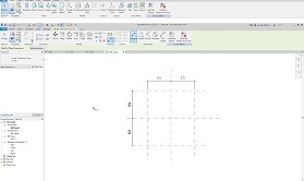
To determine what tools and features to prioritize, I consulted with Matthew and Nicky, as well as learned to model several basic families in Revit to get an understanding of the standard workflow. The following is an example workflow of creating a simple parametric table family.
Place 2 parallel reference planes (planes in XYZ space) in the 2D Top view, one on the left and one on the right of the origin point.
Use the Aligned Dimensions tool to define the distance between them, then set it as the “length” parameter.
Repeat that for top and bottom and define the distance as the “width” parameter.
Select extrusion and draw a rectangle shape where each side is locked to the 4 reference planes.
In the Front view, place a reference plane parallel to the initial 2D view and define the distance as the “height” parameter.
Set the rectangle extrusion from the Ref Level up to the height plane to create a tabletop.
One process that might seem unintuitive to non-architects is the use of reference planes. The general wisdom is that using reference planes as invisible anchors leads to more scalable geometry with more predictable outcomes than trying to bake it into the geometry itself. They essentially act as variables in 3D space and abstract away the need to "hard-code" values.
Due to the complex workflow, I made a decision to limit the MVP to the following requirements.
Adding reference planes (RPs) - Adding RPs will probably be the most important UX to get right.
Setting parameters - Creating and applying parameters should be smoothly woven into the reference plane creation UX.
Explicitly showing logic - Showing geometry logic explicitly in the interface instead of just in the visual space will allow better evaluation of the model.
These requirements focus on Torus' unique value proposition of a simplified parametric workflow rather than the generic 2D/3D geometry tools that all CAD tools need to have.
The UX of Adding Reference Planes
As stated previously, Matthew and Nicky suggested early on that all user-generated RPs need to be children of another RP. In contrast, Revit treats RPs as independent placed objects that are situationally constrained through other tools. As such, I decided that the default RP tool was not an “Add RP” tool, but a “Create RP by Offset” tool that creates a child RP from a designated parent RP, enforcing a formal hierarchical relationship among all RPs.
After several iterations, I decided on the final behavior of the OffsetRP tool.
The user chooses a Parent Plane
The cursor transforms to a plane that is parallel to the Parent Plane with a Distance Indicator.
The user manually places a Child Plane by clicking in the workspace.
There was a design fork at Step 3. I could make the user input a distance and/or parameter, and the child plane gets generated automatically. I ultimately decided against this and opted for the user manually placing it with the cursor. I didn’t want to completely strip away the pen-and-paper drafting mimicry that Revit relied on as I was told verbatim, “most architects are still artists at heart, and not developers.”

The UX of Setting Parameters
Next, I worked on streamlining the UX of setting parameters. In Revit, setting a single parameter is a minimum 2 step process with 2 different tools.
For Torus, I wanted to reduce it down to 1 step and 1 feature by seamlessly integrating the parameter setting with creating RPs. I designed the offsetRP tool to have an automatic distance indicator. This distance indicator consisted of a dotted line connecting the RP to its parent and a value box. I designed the value box to turn into an input field where the user can then type in a parameter name and press enter to confirm.

The OffsetEQRP Tool
Later in the MVP design process, I slightly expanded the scope and designed the OffsetEQRP tool to accomodate for a common workflow. Since many families are symmetrical, a common Revit workflow is creating pairs of parallel RPs and then constraining them to be equidistant (EQ) from a center. To streamline this particularly common flow, I designed the OffsetEQRP tool to behave similarly to OffsetRP but automatically generate a mirrored RP. Both RPs would be added under an EQ group in the asset panel, and a parameter can be applied to the total distance between both RPs.

Demo Building
Once these 3 features were designed, I took on the role of developer, testing coordinator, and UX interview conductor. I first built out a working demo for the Torus MVP, mainly through prompt generations using Codex in VSC. In the process of building the demo, I made a few necessary UX and UI changes as my perception changed while using the tool in an interactive state.
Added color scheming for the global axis (Z-Axis = yellow, Y-Axis = blue, X-axis = red). In order to accommodate for more colors present, I removed the bright pink and reduced the bright green.
Added ID indicators to the cursor when hovering over a global plane.
Added resizing handles to the ends of the RPs that allowed users to visually change the perception of the RP. This doesn't change the underlying geometry.

Demo Testing & Iteration
Once the demo reached a testable stage, I reached out and found 6 participants that were architects or students. Their experiences with Revit ranged from a class to 10+ years. I ran 10 minute usability tests to see if users could add reference planes and set parameters. Before each session, I emphasized that this was an early stage demo with limited capabilities.
4 participants managed to complete both tasks. 2 participants completed both tasks with minor guidance. This was a major accomplishment and speaks to the design being relatively intuitive. A few participants remarked that this would have been much more difficult in Revit.
I observed the following usability issues:
All participants first attempted to input numbers inside of the distance indicator rather than an expected parameter name.
3 participants pointed out that the parameter panel was not particularly clear.
All participants tried to hover over the tools expecting tooltips.
I made the following changes based on the observation and feedback:
Added tooltips to offsetRP and offsetEQRP and increased the speed they show up.
Refactored the distance indicator to have two input triggers. The old indicator became the value input will allow users to manipulate the simple distance or the value of a set parameter. A new parameter input button gained the functionality of the old indicator. To accommodate for this change, I also moved the EQ group tag from from the indicator to the line to avoid confusion.
Changed the styling of the parameter name and value sets by wrapping them in a single div that resembles a split input box with an explicit "=" between the name and value.
I tested this new iteration on 5 users and the qualitative results significantly improved with 100% completion rate.

Next Steps
Now that the MVP can set up the parametric “bones” (as Matthew likes to call it), the next steps would be to enable users to create 2D geometry and then turning it into 3D geometry. I’ve already initiated the design process of streamlining another infamous Revit function of locking 2D geometry to RPs. In overhauling Revit’s lock system. I developed the “clasp” system that is paired with color changing in order to visually communicate geometry snapping to RPs. Next logical steps will be to build out this system to demo and test.
A more philosophical question also emerged during testing. Less experienced users, particularly students, leaned more on the 3D perspective view. Several participants explicitly stated a preference for working in 3D. In contrast, more experienced users valued the 2D views that enable a more precise parametric workflow. This divergence revealed a design tension: making the 3D perspective view more interactive could lower the barrier to entry for beginners, but doing so would conflict with Torus’s prescriptive workflow and its core value proposition.
This finding suggests that more research is needed to better understand how experience level influences spatial workflows and mental models.

Conclusion
Torus was one of the most rewarding and challenging projects I’ve worked on and required hands-on involvement across every stage of product development, from research and wireframing to agentic development and usability testing. This project demonstrated that even deeply technical, legacy workflows can support intuitive, modern UX when designed with clear structure and intention. Ultimately, the successful feedback results of the initial MVP showed that a modern parametric CAD tool can be intuitively understood and used in under 15 minutes.
I’m grateful to Matthew and Nicky for sharing their domain expertise and for their close collaboration throughout the project.