Creating Blueprint: Toll Brothers’ First Digital Design System from Figma to Code
Over three years, I built Toll Brothers’ first digital design system and evolved it from a static style guide into a design-to-code workflow.
Goals
At the start of the Figma migration, I was given the nebulous task to create a design system for Toll Brothers. As I learned more about design systems in general, I developed 3 concrete goals. When agentic workflows became popular in 2024-2025 and the Figma MCP was released in 2025, I added a 4th goal.
Research best practices and theories from articles and industry-standard design systems.
Gather pre-existing Toll Brothers site elements and assign an identity and rationale to each element.
Promote components and tokens as the common language between designers and developers.
Later addition - use an agentic workflow to create a design-side code environment as the main handoff to developers.
Research
I conducted the majority of my research in 3 locations:
Existing Toll Brothers documentation
Popular publicly available design systems
Select articles on design system processes
I began by compiling and indexing all design elements from the official brand guides, the live site, and previous wireframes. I surveyed the landscape of industry-leading public design systems.
Material Design 3
Lightning Design System 2
Polaris
Atlassian Design
Human Interface Guidelines
IBM Carbon
While these offered best practices for systems at enormous scales, Toll Brothers has a tightly-controlled brand guideline and needed to adapt those practices for a smaller scale. To better understand the underlying theory behind creating a design system, I read several articles on the topic and picked two to highlight.
The first is “Implementing a Pattern Library in the Real World: A Yahoo! Case Study” by Erin Malone (2005). In this article, Erin frames the process, not as creating an artifact called a design system, but simply as solving pain points in team communication. The second is “Building a Visual Design Language” by Karri Saarinen (2016), detailing how his bootstrapped Airbnb’s Design System. One of my favorite lines describes how principles do not naturally translate into practice.
“Traditionally, many style guides define components as atomic components, which are then used to build more complex molecules. In theory, this works well to create coherent and flexible systems. In practice, however, what often happens is that these re-usable atoms are used in many different ways, allowing all kinds of molecules to be created.”
In synthesizing my research, I fleshed out these 4 key concerns that Blueprint needed to address.
Categorization - How are assets and ideas organized
Accessibility - How to make the site more accessible to users with disabilities
Tokenization - How to systematize design decisions
Adoption - How to get everyone on-board
Concern 1 - Categorization
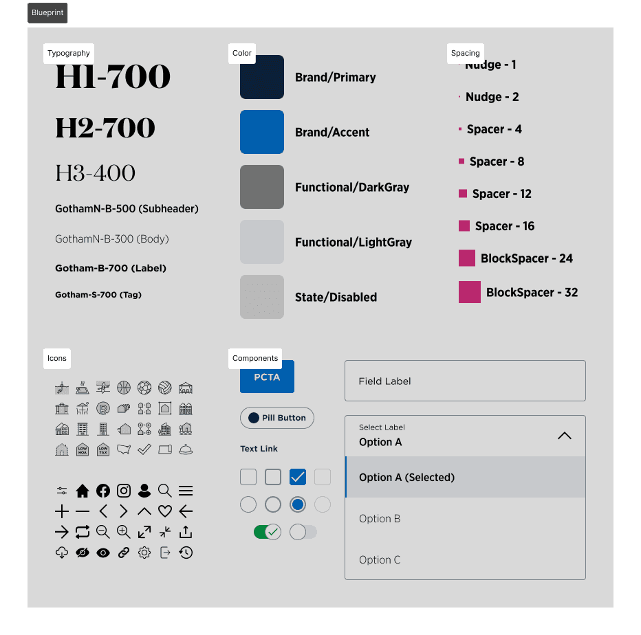
At time of writing, the industry-standard design systems I looked at generally converged on three major categories of design objects.
Foundation/Style/Guidelines references visual concepts like color, typography, accessibility, layouts, and spacing and even branding and vision.
Components are the basic building blocks for digital design. A button is the quintessential example.
Patterns are typically defined as things that solve a specific need. These are usually platform specific and have wide variability in look and feel. A form field is a quintessential example.
After taking inventory of all our most reused visual elements on site, I organized all of our assets into Foundations, Components, and Patterns.
Concern 2 - Accessibility
Accessibility can have a steep learning curve. Based on personal experience, many designers seem to only consider color contrast and component sizing because designers have the most agency over those aspects. While it’s a good start, a more holistic approach to accessibility requires a more thorough understanding of WCAG 2.2, the standard authority as of 2025.
I started with WCAG’s Easy Checks to help assess basic accessibility concerns. Then I read through the official 13 WCAG guidelines, focusing on the ones relevant to Toll Brothers, and presented the findings to designers and developers. The documentation for this auditing process is currently the bedrock for accessibility in our design system.
The following are the most actionable guidelines for designers from WCAG 2.2.
Guidelines 1.1 and 1.2
Add alt text for all images, floorplans, site plans. Add captions to videos without dialogue.
Guideline 1.4
Maintain color contrast minimums. Ensure 200% text resizing makes sense and can be navigated without two axis scrolling. Ensure obscuring overlays are easily dismissable.
Guideline 2.1 and 2.4
Ensure the site is navigable by keyboard. Provide shortcuts and descriptive cues to aid keyboard navigation.
Guideline 3.3
Ensure form fields are properly labeled with ARIA. Provide suggestive inputs when we can reasonably assume input. Provide suggestions for correcting incorrect inputs.
Guidelines 1.1, 1.2, and 3.3 are non-visual and generally require code to implement, so it seems like the responsibility should fall under developers; however, the rise of design-to-code workflows has diven designers more agency in ensuring non-visual accessibility guidelines are also being met.
Concern 3 - Tokenization
4 of the 6 design systems (Google, Atlassian, Shopify, IBM) described a tokenized approach of taking design decisions (i.e. color, spacing, typography, corner radii, object shadows) and setting each individual value into a token. As a token set scales, all 4 introduce the concept of a layered setup that resembles the following list with some variations.
(Layer 0) Raw Values: represent all possible tokens that could ever be in the system. Not usually considered an official layer. (#0070CD)
(Layer 1) Reference/Base/Foundation Tokens: denote a limited set of tokens that will be used in a project and each token is named with a scaling system. (blue.400)
(Layer 2) System/Semantic/Alias Tokens: explains the reasoning of a single decision node. These should be the most widely token format in Figma. (background.blue)
(Layer 3) Component Tokens: used exclusively for a specific reusable component. These should be used in development to control the final UI. (button.background)
In considering what would work best for Toll Brothers strict brand guidelines, I adapted this setup by collapsing Layer 0, 1, and 2 into a single tight set of semantic tokens for color and typography in Figma*, and eventually, I coded the component tokens for StorybookUI. I believe this is the best practice for a tightly-controlled brand to adopt tokenization.
* Figma uses the technical terms “Text Styles” for typography and “Variables” for colors and numbers, but for simplicity's sake, we referred to them all as tokens.
In addition to tokens for color and typography, I also fleshed out the spacing tokens using a grouping system.
Nudge Tokens: added to permit a rule break from a strict 4px system. In general, many design systems rely on 4px as the smallest spacing unit, but things like icons often need to be visually nudged to “look” correct.
Spacer Tokens: space elements within a specific component.
BlockSpacer Tokens: space components or items with no visual boundaries from each other. These are generally used for lists and pages.
DividerBlockSpacer Tokens: space items that have visible boundaries from each other.
I want to quickly address the 2 exceptions to the general layering rule. Apple's Human Interface Guidelines skips recommending tokens entirely because it ultimately does not want brands to prioritize branding while designing for Apple's hardware. Salesforce Lightning Design System-2 is moving away from tokens (present in SLDS-1) in favor of styling hooks. Styling hooks use conditional logic to derive a token value vs the token having a pre-selected value. While tokens can also be adjusted by conditions (like light and dark mode), each additional condition multiplies the amount of tokens necessary to fully capture a multi-condition matrix. Styling hooks solve this problem by producing the end value purely through logic instead of assignment. Luckily for us, this level of strategy is overkill for Blueprint, but it might be more appropriate in the future when theming becomes a priority.
Concern 4 - Adoption
“Should work in theory” does not always translate to “works in practice,” and adoption can often be blocked by either user inexperience or unintuitive design. As such, I evangelized Blueprint with explainer decks, quick reference sheets, and feedback sessions. My fellow designers provided me with valuable feedback to help me adjust and iterate on the design system, just like with any other project. Ultimately, the knowledge sharing did help the design team save hundreds of design hours pouring over micro-decisions, and increased speed to handoff. However, we did hit a wall with cross-team adoption. Since the entire company was in mid-migration to Figma, overall knowledge of Figma was still inconsistent across design, dev, and eventually the marketing teams as well. This often led to awkward communication issues and constant back-and-forth. Wireframes were sometimes being interpreted visually rather than through assigned styles or tokens. Tokens were also inconsistently applied. Addressing this issue only through knowledge sharing would have been an uphill political task.
Figma-to-Code and the Agentic Workflow
At time of writing, the Figma MCP (F-MCP) was released a few months prior, and it has profoundly shaped my current thinking for design handoff workflows. The “source of truth” should ideally live in a codified repository like Storybook rather than in Figma. However, we lacked the dedicated engineering resources to build it. Early on, I experimented with AI coding using Claude, Gemini, and ChatGPT to try to create a Storybook for Blueprint, but at that time, these AI tools had speed and reliability issues.
The release of the F-MCP was a game changer that enabled AI plugins like OpenAI’s Codex extension in VSC to directly read Figma file exports as context. As such, I guided Codex to create a working component in code based on its construction in Figma. I dictated the exact token setup to match the intent in Figma. With guidance, Codex interpreted, added, and applied tokens from Figma into Storybook. I directed the components to be built with accessibility requirements in mind. Beyond individual components, I experimented with feeding Codex entire wireframes to generate functional prototypes.
The agentic workflow helped kill three birds with one stone.
Designers no longer need to spend hours ensuring every single frame is perfectly tokenized; AI agents have the context to apply tokens correctly even if the input is imperfect.
Delivering a tokenized, coded prototype eliminates the need for developers to manually scan Figma or decipher design-centric token structures.
By hosting Blueprint in Storybook, designers can ensure accessibility requirements are met not just visually, but functionally in the code.
Full implementation of using Storybook as context for an agentic workflow are still being tested, but early tests of the automated prototyping feature have been promising. Naturally, the next steps will be to audit each component to assess how far they are from production-ready status.

Conclusion
Blueprint did not emerge from a linear path, but rather through ongoing feedback cycles, adaptation to new technology, and the guiding principle of meeting people where they are at. Prior to the Storybook implementation, Blueprint had already successfully facilitated a company-wide Figma migration and saved hundreds of hours in design time. Now that it is being built in code as part of an agentic workflow, Blueprint has evolved from static documentation into a living translator between design intent and functional implementation.